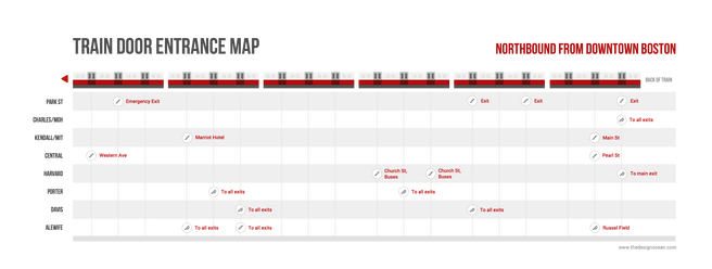
Red Line Train Door Chart
When I was living in Boston, I had a daily commute that would involve catching a train on the red line. Some of these train platforms are quite long and if you accidentally go through the wrong station entrance or exit, you could lose 5-10 minutes because of up-above traffic and road crossings. As a commuter, you begin to memorize which entrances work best for your route, but you don't necessarily memorize them for other routes that involve different stations.
I wanted to create a chart that could help people decide which part of the train to enter or exit depending on the station they're getting to.
In summer of 2015, I decided to ride the red line in Boston/Cambridge back and forth for 3 hours. I captured which train door to enter in order to disembark quickly at different stations. I then shared with this the Boston community through social media so that others could also optimize their travels.
The chart appeared on Reddit after I posted it to my blog and received over 20k views overnight.
The charts
The first two maps to South Station show the train as it would appear when you’re standing at the inbound platform facing the train. The train is traveling south to the right if you’re at Alewife, Harvard, Central and Kendall, and it’s traveling south to the left if you’re at Davis and Porter.
Click on the images below to see them in high resolution.