Wespire
Wespire's activity page
WeSpire's enterprise platform contains projects and activities that help employees track their personal goals such as eating healthier or volunteering more. Each of the activity pages detailed how to do the action, why it mattered and products that would help users achieve it.
It wasn't immediately obvious what the goal of the page was, so I proposed an alternative design to the product team in 2015 that would help users complete the activity step by step.
The original design: one button that the user presses to indicate that they had accomplished their goal. There's no validation for the work that the user did to earn this accomplishment.
The redesign below: steps to help the user feel as though they are achieving something by presenting a clear way for users to progress through the activity rather than completing it all at once with a "Mark Complete" button.. Their employer gets validation that they have actually accomplished their goal. Visually, I tightened up the general styling to make the interface feel more friendly and easy to interact with.
Wespire's Brand Admin Page
WeSpire is an enterprise software hosting dozens of companies. An activity that the team does frequently is creating a new brand (program) for a company that's just joined.
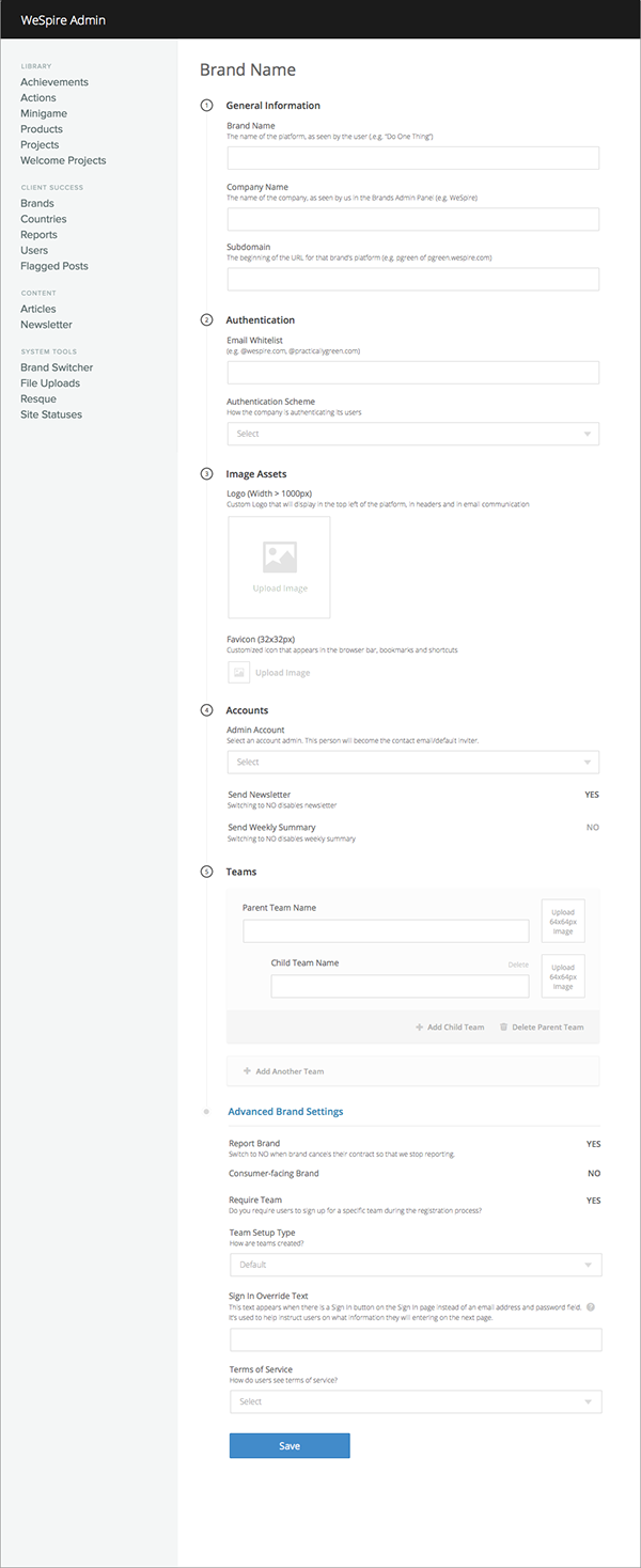
The original screen: The creation of brands has been a painful undertaking that required knowledge of the webpage's history. Half of the text fields are unintelligible and many are never used at all. The tab structure of the web pages fractures the interface into many parts and makes the process longer than it needed to be. The formatting of the pages obscures the hierarchy of certain fields.
The redesign below: All the information that has to be filled out exists on a single screen. This simplifies the work into smaller steps and makes both text field validation and editing easier. I talked to every member of the customer success team that works with this process and decided with the engineering team which fields and checkboxes to remove. Many items that are currently being used by companies but not necessarily prioritized internally were moved to an "Advanced" section at the bottom of the screen. I also added explanations/hint text for information we did ask for so that anyone on the team can add a brand without checking another one to understand its context.


